

Story
Corporate Design Story - HURME
Anybody ever heard of Hurme?
This question kicked off another huge project here at FIFTYEIGHT PRODUCTS in Spring 2019.

Hurme?! Some kind of Scandinavian concept for joyful, cozy vibes? No wait, that’s Hygge! As it turns out, Hurme refers to Finnish designer Toni Hurme who recently created an entire family of typefaces, named after himself.
It was the unique aesthetic of Hurme’s eponymous font family that really caught our eye and provided the impetus for a significant facelift of our corporate design after what had been more than ten years.
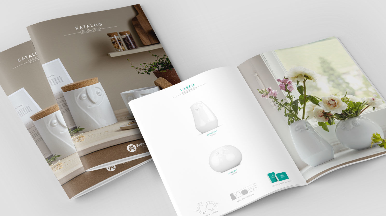
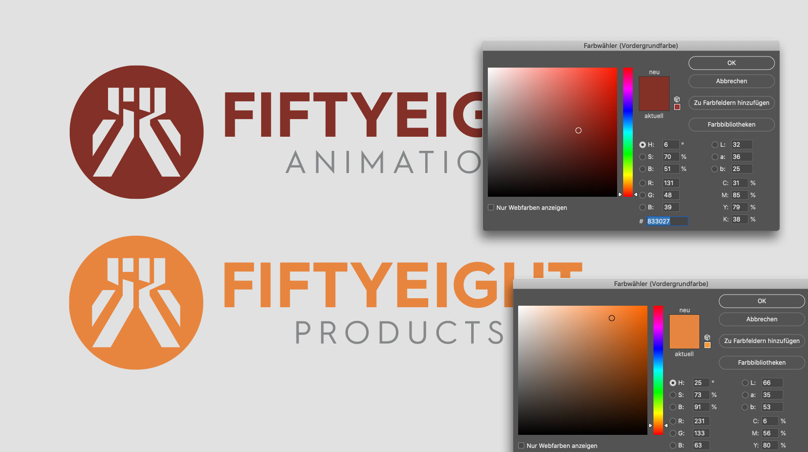
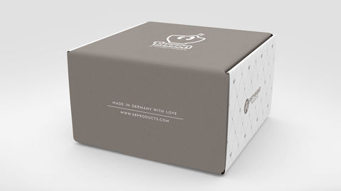
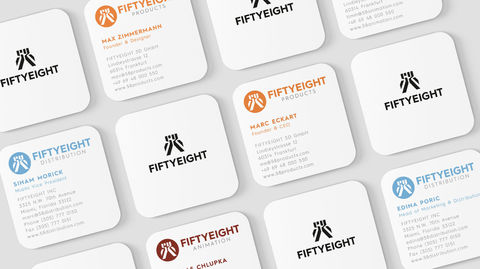
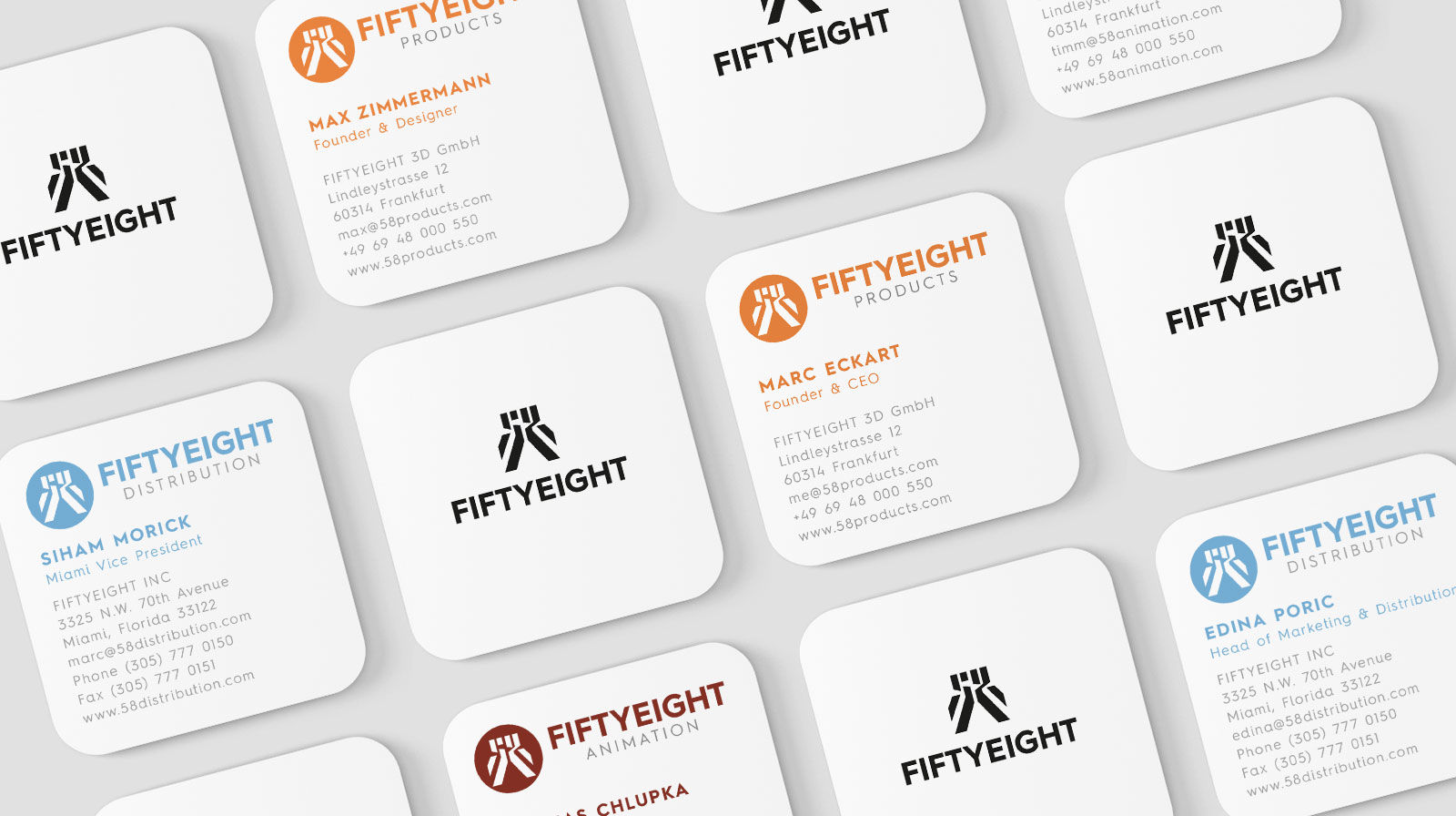
We were well aware what a new corporate design entails. New logos, new color codes, new catalogues, new business stationary, new business cards, new product packaging, new website and much, much more. The full Monty!
 |
But we took a really deep dive and tackled the complexity of this ambitious undertaking with vigor (and Hygge).
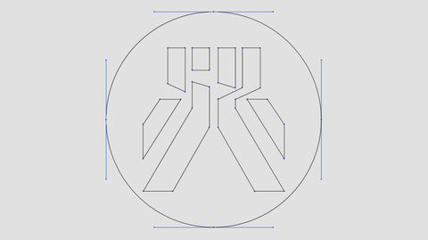
"What was really important to me: On one hand reducing the diversity of shapes in our branding, since it happens in so many places, from communications to packaging, and on the actual products. And on the other hand make the ‘58’ more visible as the heart of our logo,” said Max Zimmermann, Managing Partner at FIFTYEIGHT, who developed the new corporate design.
Seriously? A redesign from the typeface all the way to the style guide?! It’s really the only way to keep things consistent, as everything we communicate about our products – whether it’s printed or digital – involves typeface. If you will, typography is the primal essence of branding. The appearance of type is what creates an emotional baseline frequency in observers.

Everyone feels it in daily life, for instance in the emotional impression of a website or a store window or the layout of a magazine. The conscious arrangement of shapes and colors is always a way to make a statement.
But still, why go through all that effort? The previous typeface was perfectly legible and not some kind of hieroglyphics. And the corporate design was pretty stylish. Plus, the online store was neat and easy to navigate.
So why torture ourselves?
 |
Good question, but the world is forever in flux and trends come and go, while our overall perception also changes. What may strike us as cool and modern and progressive today will seem outdated and archaic tomorrow. Let’s not forget, there’s always the element of functionality as a major North Star for everything!
Design is not just what it looks like and feels like. Design is how it works.
- Steve Jobs, founder Apple Inc.
What sounds like a slogan for the Bauhaus School of Design is actually a quote by the founder of Apple Computers. Steve Jobs was adamant in his philosophy that “form should follow function.” And if anyone ever viewed this maxim as imposing limitations, the diversity of Apple’s product designs over the years clearly proves otherwise. Which brings us to the new FIFTYEIGHT PRODUCTS website.

It was already quite a good site, but now it’s even better. Not just in terms of a visual design upgrade and new typeface. We have also taken key steps to increase the functionality for our users. Everything is more clearly structured and easier to navigate without getting lost. Larger images display more details of our products. New features and optimized structures guide visitors along as they explore our world. Internationalization is also a major focus at work here.
For all our international markets, we will offer local websites supplemented by products and social media channels, which is important for our international consumers and B2B clients.
test
Best of all, what you can see right now is only the beginning. We’re currently working on integrating our social media channels into our 58products.com website. Which, as you can easily imagine, will unlock a wealth of new functionality such as integrating comments, opinions, likes and news content into our website in real time.
“Our stories, films and social media posts were an important focus from a content perspective during our relaunch. Visually speaking, our news format is trending more towards a magazine aesthetic,” said FIFTYEIGHT’s Managing Director Marc Eckart, who is in charge of the website and online store.
Just like any major project, this one took quite some effort from all involved. While other companies enjoy the luxury of working with an external branding agency, we took it upon ourselves to master the complete development and implementation of our new corporate design completely in-house. Needless to say, this herculean effort came on top of all our other day-to-day to business, of course.
We ended up rising to the occasion, which is no surprise, since everyone knows FIFTYEIGHT as an animation studio with more than 20 years of experience including development all TASSEN characters. On that note, our assortment of products now consists of over 40 different characters that bring joy to people in more than 60 countries.
Because after all, spreading the joy has been our company philosophy and rooted deeply in our FIFTYEIGHT DNA since day one. And that, is one thing that’s not going to change anytime soon.
We promise.
 |
 |
 |
 |

